George Maciunas: A Finger In Fluxus
Artists may talk about the relationship between art and life (note Robert Rauschenberg's 1959 statement, "I try to act in that gap between the two")(1) and never leave the subject of painting or sculpture ; or they may put their talents to practical use (cf. the Bauhaus) and attempt to transform their environment by means of idealized objects. When lifestyle itself is made into art, it is assumed a priori that the art is enhancing the life, not the other way around. But in his work for Fluxus George Maciunas not only took an "art attitude" toward every aspect of daily living, but, by inversion, was also willing to transform every seeming trivialities into esthetic folder. The literature, performances, and objects of Fluxus are rife with examples of such material as treated by a variety of artists; but by force of training as well as by personality, Maciunas exercised almost total control in the area of graphic design. The man who ran Fluxus almost single-handedly for 13 of its 16 years was also the person responsible for the "Fluxus look." And as identifiable as that look is, it was based on a set of not-purely-esthetic principles that permeated everything Maciunas did.
Skirting controversy as to how this affected much of the public perception of the movement, nevertheless an examination of this design work, and by extension of the commercial work to. which the same ideas and techniques were applied, can tell us a great deal about Maciunas himself. always in pursuit of economy and efficiency, Maciunas once produced a designer's thrift-manifest of sorts:
-
- A colored stock, which is more durable and rugged than newsprint, but costs as little because it is not bleached, is used.
One type is used throughout. Larger sizes are obtained by photostatic enlargement. Costs and arbitrary stylistic choices involved in using a variety of types are eliminated.
The text fills one conveniently sized sheet. It is thus uniform with the appendices, which must be on large sheets [because of diagrams]. Costs of cutting, binding, and blank paper for margins and decoration are eliminated. Text and appendices can also be displayed as posters. (Actually, the text was printed on a larger, standard-size stock. The unfilled part of the stock was used for another job, which was put on the same plate, and the two jobs were cut apart after printing.)(2)
In Maciunas' art-life continuum this quest for frugality applied even to food,. In the mid-'60s he tried to eat for an average a dollar a day. Methods used ranged from buying food wholesale by the crate (eating nothing but apples one week, grapefruit the next, and so on) to subsisting on the perfect combination of vitamin pills. each diet was supplemented by the dark bread of his native Lithuania, which he relished. Within a few years Maciunas had perfected a more sophisticated system: having one single lunch every two or three days in a Scandinavian smorgasbord restaurant. For a fixed price – cheaper ad midday than in the evening – he could have unlimited refills, enough to last until the next such meal.
Logic was the corollary of efficiency. Maciunas proposed a decidely non-Bauhausian functionalism, but one which, though not always consistent, was backed by his own unique reasoning. He refused to contribute to the Dick Higgins/Wolf Vostell anthology Fantastic Architecture, 1971, because he regarded its title as a contradiction in terms; but when queried about what appear to be fanciful solutions to his own design problems, Maciunas could always provide a rationale for every moment.
Given these tenets – economy, efficiency, and logic- it is not surprising that raw material for his designs came from surprisingly limited number of sources. For nearly eight years every body of text (except for a small number of commercial jobs that were typeset at the client's insistence) was published straight and unaltered from Maciunas' IBM Executivemodel typewriter, which was equipped with a condensed sans serif type.(3) When, in 1968, he purchased a new IBM with changeable faces, he added bold and italic styles, but all were still characterized by their sans serif look. Variety was achieved by photostatically enlarged type (as described above), by reverse printing (white or color against black ground), or by placing the type in patterns or facing it in different directions.
Such textual embellishments as there were (and, as already stated, these were not intended as mere decoration, but did indeed have a "function") were created from dry-transfer lettering -adhesive- backed sheets of alphabets from which letters can be pressure-applied to a surface. Mainly headlines and author or artist credits, these flourishes appear as eccentric as the texts appear uniform. This process enabled the cost-conscious Maciunas to choose from hundreds of typefaces and, with no professional typesetting fees, to vary type style or type direction or both, letter by letter.
Maciunas' third graphic component was pictorial material. For this his primary source was the Picture collection of the New york Public Library this extraordinary resource houses two and a half million filed images – many in the public domain – on every conceivable subject. Periodic raids on this treasure trove produced both banal images for Maciunas to transform and eccentric ones for him to exploit. Once in his repertoire, they could be called on again and again.
The glue that bonded these source materials into a distinguishable style was an obsessive/compulsive personality that accumulated, hoarded, classified, and dissected all visual matter within reach. how, will soon become apparent.
In this age of instant and egocentric Xerox books, it may be hard to imagine the tortuous process plus the patience and cooperation required of dozens of individuals that enabled An Anthology, the precursor publication og the Fluxus movement, to get out into the world. La Monte Young, its editor, had gathered its contents (originally for an intended East coast issue of the California publication Beatitude) in late 1960 or early 1961. the manuscript disappeared, along with Beatitude's regular editor, for several months; by the time Young got it back it was evident that Beatitude East was no longer. Shortly thereafter Maciunas, whom Young had met only a few months before, learned of the project and offered to turn the material into a book, convincing Young had met only a few months before, learned of the project and offered to turn the material into a book, convincing Young and soon-to-be copublisher Jackson Mac Low of his sincerity by immediately producing reams of beautiful colored papers from his AG Gallery storeroom.
Still more months went by, and the gallery folded, before Maciunas got down to work. He enlisted the help of Mac Low and others for the typing and preparation of mechanicals while he sat, as Mac Low has described it, "at his drawing table for 21/2 days solid producing the now-famous designs for the title pages and section titles of An Anthology." Mac Low also relates how the sale of Maciunas' stereo set to Dick Higgins ensured the down payment for the printer at which point Maciunas took off for europe, leaving everything in Young's and Mac Low's hands.
During the months that followed An Anthology was printed literally page by page, as negatives were corrected, pages retyped, and enough money scraped together to convince the printer to keep working. To this end, two benefit concerts, starring An Anthology's contributors and their friends, were held at the Living Theatre early in 1962. when a well-to-do friend of mac Low's finally paid the balance of the printing bill, the book was still far from complete; having been printer in single pages rather than in signatures the entire edition of 1000 copies had to be collected by hand. this was accomplished at a series of parties and the books, now in order but still unbound, were stored in first one loft, then another. Maciunas sent the cover design and sample stock from Germany; Young raised enough money for the cover, binding and trimming; and the book eventually appeared in May 1963, nearly two and a half years after conception.(4)

If this recounting seems as lengthly as the book's production, it points up the often lugubrious circumstances under which Maciunas and his friends labored to produce publications. Reliance on his own handwork and the unskilled labor of others remained accepted procedure for circumventing high costs throughout Maciunas's life. As for the look of An Anthology itself, the book belies its chaotic method of assembly. The diverse scores and texts -representing "chance operations, concept art, anti-art, indeterminacy, improvisation, meaningless work, natural disasters, plans of action, stories, diagrams, music, poetry, essays, dance constructions, mathematics, compositions'" – are woven together by Maciunas' consistent but ever-changing type patterns and a variegated selection of muted colored papered interleaved with white. these papers, flecked with imperfections (they are cheap kraft papers rather than fine coated stock) often appear in different, probably random, color sequences in different copies.
An Anthology is a very good example of Maciunas' flamboyant use of type and his meticulous placement of it on the page, as well as a demonstration of the spectacular effects he could achieve even while saving money. One is particularly struck by the multitude of colors, introduced exclusively by the use of the colored papers (black is the only color of ink used throughout). The given practical reasons for choosing such paper have already been mentioned, but it is significant that colors used for individual pages are apparently interchangeable: Maciunas was colorblind, and this trait shows up again and again throughout his work.
Its most common manifestation is in the use of alternate colors of the same paper stock for printing a single graphic piece, as is done in An Anthology. In at least one other case the color sequence of paper – red, chartreuse, or grayish green – is so distinctive that one can identify and date at a glance any one of the large variety of printed pieces produced in several runs over a nine-month period (among the known items are the 1965 Fluxorchestra concert flyer and program, stationery for Maciunas and others, Fluxus edition labels, and the first published version of Maciunas' art historical chart). In addition to his genetic inability to recognize certain hues, some credit for Maciunas' choice of offbeat colors should also probably be attributed to his frequent purchase of job-lot papers in a further attempt to save money.
Specific color as an integral part of the design was used so rarely that it is worth mentioning. Ironically, one such piece received wider distribution, through its reproduction in numerous books and articles, than anything else Maciunas ever produced: the famous (but not publicly attributed) anti-Vietnam War poster that he designed in 1967. It depicts an American flag with stripes of red text documenting genocide figures and a star field of while skulls-and-crossbones. Its predecessor, a smaller but similar piece designed the year before, advertised a documentary film series titled "America today." also similar in concept, though less harsh in message, is the red, white, and blue cuban flag used to promote a film documentary several years later."(5)
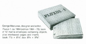
"Fluxus" as the name of group only came into use at the beginning of the European series of concerts in September 1962. thus An Anthology, which first appeared fully bound only in 1963 but which had been put together as far back as 1961, is generally considered "pre-Fluxus"(6) Fluxus 1, published and edited in an even more fragmented manner by Maciunas alone, mostly after he returned from europe in 1963, remains the epitome of the movement's high style. the format of this "yearbox," which required meticulous hand assembly that was entrusted by Maciunas to no one else during the 14 years or so that the edition remained in production (from about 1964 until the time of Maciunas' death in 1978), consists of a bolted binding that holds together pages made from manila envelopes interspersed with booklike leaves in different sizes and types of paper. Copy comes from the familiar IBM and a smattering of rubber stamped titles, including the cover. Enclosed in a wood box, and containing small objects in its envelopes, it is itself as much object as book. And it was sold cheaply (more than ten years after the first examples appeared Maciunas would still provide copies for between $20 and $40 apiece) on the premise that Maciunas' own handwork cost him nothing.
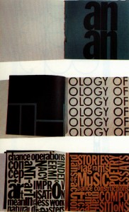
One can examine the interplay between Maciunas' "fine art" and commercial ideas by comparing Fluxus 1 to a commissioned piece he produced in 1966, roughly the same period that saw early copies of the yearbox. Although a major function of Fluxus 1 – the incorporation of small objects – is missing (thus eliminating the need for envelopes), and although A Guitar Manual(7) is conventionally staple-bound, the two books are surprisingly similar in graphic design. Both are based on a square page module of approximately 71/2 by 71/2 inches (Fluxus 1 has an extension for the bolted spine, but the exposed, usable space is the same). Both use the same coarse gray kraft paper and white coated stock. Truncated pages alternate with full-size ones, text is columns of IBM type, and the overall color scheme is restricted to black, gray, white, and tan.
In both An Anthology and Fluxus 1 some recognition is given to the burgeoning movement of concrete poetry, primarily by the inclusion of the work of Emmett Williams, an American who had been living in europe since 1949. this movement, which developed simultaneously in different parts of the world in the '50s,(8) never really caught on in the United States, reaching somewhat of a peak here with the near-simultaneous production of anthologies by Williams and Mary Ellen Solt in the late '60s.
Maciunas, whose visual solutions (by his own definition) should be considered utilitarian rather than poetic, was certainly aware of this trend and was influenced by it, mastering several techniques for combing text and image. One was to integrate the text into a picture in such a ways that it is barely discernible *somewhat as the New york Time's caricaturist Al Hirschfeld works the name "Nina" into his drawings). the 1965 mailer for Eric Andersen's "Perpetual Flux fest" concert is a blowup of Andersen's face in oversize halftone dots, filling the page and at first glance providing no message. a second look reveals the concert information surrounding his right eye, with IBMtypewriter characters replacing individual dots in the screen. so intent was Maciunas on unifying type and design that he even wrote copy to fit a preconceived idea. A Fluxus letterhead he designed in around 1967, for example, is based on a justified column of type exactly nine characters wide running along the righthand margin. worked into a list of Fluxus projects and terms that include intelligible categories – "Fluxbooks," "Fluxboxes," "Fluxchess," "Fluxfests," and others – are linguistic contortions such as "Fluxestra" (for Fluxochestra) and "Fluniture" (for Fluxfurniture).
But Maciunas' most persistent use of letterforms as design was in the application of dry-transfer type to make intricate and ingenious arrangements. these might serve as titles or, more commonly, as monograms identifying Fluxus artists, friends, and hangerson. as a result of his economical use of page space right up to its borders, a tight rectilinearity characterizes these as well as virtually all of Maciunas' designs.Each of the 60 monogram designs contains an individual's full name or surname (rather than just initials) spelled out within a square roughly 21/4 by 214 inches.(9) some, such as the one for Ay-O, are purely graphic; others, such as the ones for Christo and Diter Rot (also known as Dieter Roth) are visual puns on the style of the artist's work; several make puns on a name itself, as with the enlarged ampersand in the middle of Eric Andersen's name or the relationship of Philip corner's name to the corners of its square. the majority, however, are treated as graphic puzzles, in which overlapping letterforms, character inversions, and wildly varying type sizes create often difficult visual challenges for the viewer. rather than acknowledge any "arbitrary stylistic choices" Maciunas could reel off a host of interconnected justifications: on the one hand he didn't waste paper, since he could squeeze odds and ends left on the type sheets into even the most peculiarly shaped empty spots; on the other, he didn't waste a single letter because when he ran out of one alphabet he could switch to whatever was on hand; and besides, puzzles exercised the ind and thus were useful in much the same way as chess.
In the monograms as well as in so much of his work he seemed to have an endless aptitude for invention. But he sometimes considered it appropriate to rework and reuse ideas, his own well as others, and then he would do so unabashedly. Specific materials, techniques, and subject matter might be used in cycles during which he would refine an idea by repeatedly exploring all its intrinsic possibilities. at bout the time he was preparing the Eric Andersen "Perpetual Fluxfest" announcement already mentioned, Maciunas designed an ad for an upcoming Fluxorchestra concert utilizing the same dot-replacement technique. Over a three-year period following, enlarged halftone screening appeared in several other posters and flyers.
These designs, by virtue of the way the text al but disappears into the overall image, intentionally subvert the commonly accepted goal of poster and advertising design – readability- in favor of something that spectator gets in close. This topsy-turvy thinking endemic to much of his Fluxus work, was responsible for much of the dismissal of Fluxus by the contemporaneous art world. while the art market was backing increasingly bold and simplified images – pop, Minimal, Op, etc. – Maciunas was presenting material comprehensible only through an examination of halfhidden details.
In one of the halftone pieces he explored another idea: that of packaging. the announcement commissioned by the Museum of Contemporary Crafts in New york for the opening of their "Body Covering" show in 1968 picks up the exhibition's theme by depicting a nude torso, which is "covered" by a coordinated jacker: the announcement's envelope. within a few years Maciunas, who as early as 1965 had experimented with self-contained mailers, had elaborated on this enclosure relationship of paper and envelope in several sets of "functional" Fluxus stationery: glove enclosing hand, shoe enclosing foot, coat enclosing body. These were marketable enough to become among the few Fluxus items to be picked up by a commercial distributor, and in the mid-70's they appeared in stationery stores throughout New York City.
If Maciunas was sometimes uninhibited in borrowing ideas, usually those of format, from others, this reflects his alert observation of new ways of doing things more than it does plagiarism. He willingly gave verbal credit to his sources while invariably transforming the original versions by, as he would point out, achieving a better alliance of form and content.(10)
The first two issues of the yearbook Kalender, published in Germany in 1961 and 1962 as long scrolls, underwent such an assimilation.(11) These two numbers comprise an inventory of the avant-garde of the day: there are the Nouveaux Realistes – Arman, Christo, Francois Dufrene, Yves Klein, Marital Raysse, Daniel Spoerri, and Jean tinguely; the founders of Zero and their collaborators – Otto Piene, Heinz Mack, Gunther Uecker, Mavignier, et al.; the concrete poets – Emmet Williams, Carlfriedrich Claus, franz Mon, Carlo Belloli, Diter Rot, Heinz Gappmayr, Ludwig Gosewitz, and others; the upcoming Americans – Robert Rauschenberg and Jasper Johns; plus Piero Manzoni, ben Patterson, Nam June Paik, La Monte young, Lucio Fontana, and more. But the presentation, with the exception of some of the concrete pieces, is conventional: photographs of paintings and sculpture are lined up one under the other. Twenty years later one's impression is of an ordinary catalogue in an odd and inconvenient shape, a feeling perhaps shared by one of the editors, who published later issues in the series as standard spine-bound books.
Maciunas unquestionably became familiar with the two Kalenderrolles while he was in europe from 1961 to 1963. They were considered important publications of the new arts. either just prior to or just after his return to the United States in 1963 he too produced a long scroll. It is similar in size thought slightly smaller than the Kalenderrolles: 4 by 65 1/2 inches instead of 4 1/2 by 94 1/2 inches. It is on white coated stock, s is the first of the two rolles. But Maciunas saw the continuous sheet of paper as an opportunity to combine texts, type designs, and photographs (not of static artwork, but of performances) of different lengths without a page break. Also unlike the publishers of the Kalenderrolles (whose versos are blank), he used each side of the paper for a different purpose: one is the uninterrupted Preview Reviews, a summary of the European Fluxus concerts used as a prospectus for the upcoming American ones; the other provides an elongated, alphabetically-coded list of planned Fluxus publications.
This alphabetical coding is indicative of one of the most important personal traits that Maciunas brought to Fluxus: his propensity for order. Both images and information depended on the structure he gave them objects, like those by Arman,(12) gave meaning and importance to material otherwise easily passed over. He accumulated these objects for Fluxus boxes such as his own Burglary Fluxkit, which contained a collection of keys. Once again manipulating the concept of food, Maciunas spent years tasting and refining a meal composed solely of dumplings, in which the different courses were distinguished only by the fillings. for a long time he ate in a particular repetitive pattern to provide raw material for the artwork One Year, in which he built walls of his empty food containers from that period – a section of identical cereal boxes, another of frozen orange juice cans, another of cottagr cheese containers.
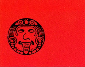
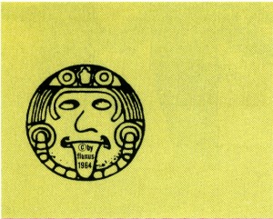
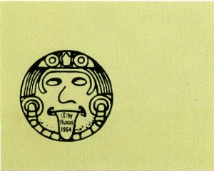
The same tendency for repetition is often apparent in his graphic work. for the 1965 Fluxorchestra concert at Carnegie recital Hall Maciunas developed a whimsical logo based on an Aztec image: a face with the tongue extended. this motif, repeated in rows of four across, appears 16times on the printed concert flyer, 24 times on the program.
The step beyond accumulating is to classify what has been rought together. Maciunas went so far as to make a systematic arrangement of excreta collected from more than twenty insects and animals (from cockroach to human) according to their order of "evolutionary" development. The resulting collection, labeled in real and pseudo-Latin, was knows Excretum Fluxorum. just as this work derivers much of its wit from a classification criterion not immediately apparent to the average person (nor, for that matter, is it a criterion based on scientific logic), so does the first set of Maciunas-designed Fluxpost stamps. their origin is a in every flea market, here depicting more than 100 embers of the Eastern Synod attending their 159th annual meeting at St. John's Reformed Church, Williamsport, Pennsylvania, in October 1905. To make the sheet of 42 stamps, Maciunas selected 42 of these portraits and lined them up according to age and amount of hair on each person's face.
History, one of his lifelong passions, received the most intense and prolonged application of Maciunas' organizational acumen. As early as 1953, when he was 22 years old, Maciunas had produced for his studied an Atlas of Russian History in which a series of superimposed maps and data hand-drawn on transparent changes in the Russian state up to the time of the Revolution. Throughout college he composed his class notes into diagrams, in psychology, music, languages, physiology. While doing postgraduate work in art history at New York University's Institute of Fine Arts between 1955 and 1960, Maciunas began his first art history chart (never completed), which he projected as a 6-by-12-foot "time/space chart categorizing all past styles, movements, schools, artists, etc." He also planned three-dimensional charts, based on cabinets with drawers full of file cards, includinf one on art history and one that recategorized the fields of knowledge and, by its storage and retrieval system, functioned as a "learning machine."(13)
Most of these projects remaned far from complete and were seen only in segments by close friends. But in may 1966 Maciunas produce the first of three published versions of a history of the avant-garde, with Fluxus as its focus. this project occupied him for the rest of his life, and the final version, still not definitive in his own mind, filled two pasted-together sheets of paper, each nearly 2 by 3 feet.(14) These published charts were composed on his IBMs, then made into mechanicals for printing. the early diagrams, however, each unique and handwritten, are superb specimens of the extraordinary, precise lettering Maciunas produced with his drafting pen. A large part of this skill can be traced to his training as an architect (he received a Bachelor of Architecture degree from the Carnegie Institute of technology in the mid-'50s), but he extended the use of this style of penmanship far beyond that of draftsman's drawings, most notable into the charts and his own correspondence.
A particularly concentrated period of such correspondence occured from 1961 to 1963, when Maciunas was among those organizing the first Fluxus concerts in Europe, himself traveling from one concert location to another and needing to communicate with the various far-flung participants. during this time his home base was Germany, where he kept a wide-carriage typewriter that could accommodate the full length (or diagonal) of the first Fluxus letterhead – a strip of brown wrapping paper about 6 by 19 inches.
It is not surprising that most of this correspondence both handwritten and typed, is extant: the letters are as consciously crafted as in any of Maciunas' more polished designs. type turns every which way, blank space is integrated into the concept, and handwriting is sometimes so tiny (with lowercase letters as small as 1 millimeter high) that, while clearly readable in the original, a first-generation photocopy is apt to blur it into illegibility (Maciunas addressed a repeated refrain to his readers: I am not writing too small?").
This correspondence highlights the sense of humor that Maciunas postulated for Fluxus, a wit evident in much of the work discussed so far. But another, darker side to that humor became more explicit in Maciunas' work as time went on. (It should be emphasized that this was Maciunas' own vision, one not always endorsed by other contributors to Fluxus.) It is clearly seen in his choice of subject matter for illustrations, most of them obtained from the library's Picture Collection. Many of those he borrowed are so commonplace as to be part of our society's visual vocabulary: a case in point is the top-hatted dandy reading a newspaper that forms the cover of fluxus Vacuum TRapEzoid(Fluxus Newspaper no.5) of March 1965, here given a typical Maciunas treatment by the use of repetition.
But more sinister implications attend pictures centered on exotic, machinelike devices and cages, chains, slings, restrictive paraphernalia, and antique medical diagrams. some particularly pointed ones were used for many of the cover labels designed by Maciunas for Fluxus boxed editions (these hundred or more labels – not all of which were put to use – incorporate the entire range of Maciunas working methods and, as such, form a miniature and comprehensive display of his work). The label for Flux Furniture is an engraving of an electric chair. Its straps are echoed in the papooselike devise that illustrates Per Kirkeby's Flux Finger Sweater. An elaborate tubular contrapation suggests how to use the Smoke Fluxkit by Yoshimasa Wada. Sometimes an otherwise innocent image is made ominious by its relationship to the box's contents; an antique medical diagram of treatment points on a figure is transformed in meaning by its conjunction wih the very real implements of self-destruction – razor, plastic bag, detached electric plug – in the Flux Suicide Kit by Ben (Vautier).
Conversely, the strong graphic impression of some old print images occasionally obscures the action depicted until one takes a second look. A Ken Friedman Box, Flux Clippings, contains actual human nail clippings. This is a typical Fluxus relationship between a title open to multiple interpretations and an object that fulfills the title in an unexpected but deliberately comyjoke way. It is the label that changes this relationship completely, and in so doing gives the piece its bite: the heavily outlines woodblock-style print of four figures at first looks simply quaint, until one sees that it portrays two executioners – one with an ax, one at the guillotine – and their incipient victims. The title “Flux Clippings” assumes a new malevolence.
One single image may be used to different effect at different times. For Larry Miller’s Office Flux Plugs, and edition begun in 1974, the label is a picture of a forefinger stuck in an anus (scatological and anal references abound throughout Maciunas’ work and are implicit in the word “flux” itself). Image and concept are completely in tune; the box, which contains dozens of objects suitable to plugging the body’s cavities – condom, tampon, pacifier, lollipop, Q-tip, nose dropper, glass eye, earplug, thermometer, etc, – was intended by Miller to be a portrait of Maciunas through his obsessions. The identical finger-in-anus image had been used ten years earlier to transmute a decidedly more innocuous collection: the washers, photographs of a sink drain and a keyhole, and pieces of perforated paper that made up Ben Vaultier’s Holes.
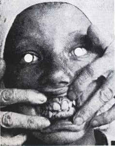
Sporadically throughout the ‘70s Maciunas elaborated on a particularly grotesque image of a grimacing face with mouth distended to show the teeth (possibly taken from a dental treatise on gum disease). Its first appearance is on the label for the Smile Machine box (first attributed to Yoko Ono, but later, after her rejection of his realization of the idea, claimed by Maciunas himself). Shortly thereafter another version appeared as a full-size printed paper face mask. This series culminated in Maciunas’ second set of 42 Fluxpost stamps, which he designed in late 1977 for an artists’ stamp exhibition, each image was a photographic variant of the original “smile,” although some are apparently from a different source. Despite these latter few faces (which are engaged in genuine laughter), the cumulative impression of the large number of bizarrely not only of perverse Maciunsas humor, but of a concentrated cry of pain.
-
- "George Maciunas, "smile" mask, 1973-74, paper, 8 x 6 1/2""
-
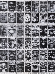
- "George Maciunas Fluxpost ("smile" stamps), 1977-78, perforated and gummed paper, 11 x 8 1/2""
These stamps were in fact done at a time of real pain for Maciunas, the period of his final illness, during which he took handfuls of morphine each day. No stranger to pain, he compared his physical trauma to what he had experienced at the age of nine when, in his native Lithuania, he had undergone a ruptured appendix operation without anesthesia. Sick with asthma throughout his life, he seemed to survive on pills, inhalators, and self-administered injections of cortisone (the empty vials and hypodermics of which became raw material for Fluxus editions). At some point he acquired an attraction for pain so intense that he enjoyed flagellation. How long this had been present in his life no one knows, but soon after he designed the Smile Stamps, he openly told friends that “the pain kills the pain.” Whatever private obsessions had been sublimated into his work and imagery, his pleasure had finally become public.
By.Barbara Moore
-
- Barbara Moore is the administrative director of the Archives of Experimental Artland co-owner of Backworks, a shop specializing in documents of experimental art of the ‘50s and ‘60s.
-
- 1. Sixteen Americans, edited by Dorothy C. Miller, New York: The Museum of Modern Art, 1959, p. 58.
2. "Note on the Graphics," from Maciunas' appendices to Communists Must Give Revolutionary Leadership in Culture by Henry Flynt. New York: World View Publishers, 1965.
3. The current owners of the typewriter, La Monte Young and Marian Zazeela, maintain that Maciunas altered the typewriter face itself by having custom work done to replace certain letters with broader equivalents.
4. All quotes and much other information about the making of An Anthology come from an unpublished article by Jackson Mac Low concerning the origins of Fluxus.
5. A singular use of nonwhite paper deserves mention here, although it ~oes not Come strictly under the heading of "color." In 1964, for the second of two broadsides he published to be handed out during Henry Flynt's "Action Against Cultural Imperialism" (the picketing of German composer Karlheinz Stockhausen's New York concerts), Maciunas took Flynt's condemnation of "white. Ruling Class Art" literally and used gray paper to indicate sympathy with the third world.
6. The term "fluxus" was first used in October 1960 in reference to a lithuanian cultural journal to be published by Maciunas and his fellow emigre, Almus Salcius. When that project evaporated Maciunas transferred the term to a projected second anthology, under his own editorship, which would Include objectlike pieces as well as printed matter. By early 1962, while in Europe, he had expanded this concept into a series of seven yearboxes overseen by a worldwide editorial board. Only two of the seven were ever published, the fllst of which was Fluxus 1.
7. Peter Huyn, Gene Leis, and Daniel Mari, A Guitar Manual, E. & O. Mari, Inc, n.p, 1966.
8. It is commonly accepted that the Swiss Eugen Gomringer, who wrote his first concrete poems in 1951 (published in 1953), the Brazilian Noigandres Group which was formed in 1952, and the Swedish Oyvind Fahlstrom, who wrote a concrete poetry manifesto in 1953, were working independently in the beginning, unaware of each other's work.
9. Two additronal monogram designs precede those discussed here and, by the differences in their style of execution, indicate much about Maciunas' development in this formative period. One, a hand-painted calligraphic flourish made from his two initials in which the "M" evolves from the hook of the "G" and nestles inside the latter's curve, appears in a small business card for "George Maciunas !graphic designer & printers [sic] representative" and, in a redone version, in tandem with the logo he designed in the same style for his AG Gallery. Both olthese date from 1961; at the time Maciunas was experimenting with amorphously shaped, chance-determined ink painting, whose free forms he explained with a labored statement on the merger of graphic expression with state of consciousness. Other hand-done lettering appears in his early work, most notably-and finally-as a Fluxus letterhead of 1962, after which this technique was abandoned. The other early monogram, for Yoko Ono, was a precisely hand-drafted "Homage to Yoko Ono" nearly filling an 8'12-by-11-inch page, one of a series of homages that Maciunas created in Europe in January 1962, and the only one in this form. Intended deliberately as a puzzle (it bore the legend, "the diagram says 'Yoko Ono' in case you cannot figure it out"), It was later redrawn with some variations and reduced in size to match the format of the other small cards
An English company, Letraset, invented the dry-transfer lettering process in the late '50s and first introduced the sheets into the United States about 1961 As can be seen, his discovery of this process radically altered the style of Maciunas' work.
10. One obvious possibility that comes to mind is the apparent similarity of format between Fluxus 1 and the 1927 bolted book by the Ital ian Futurist Fortunato Depero, Depero Futuristo. This will not be discussed here because there is currently no documentary evidence that Maciunas was aware of the earlier work prior to his own use of the bolted idea.
11. Kalenderrolle 61 (No.1) and Kalenderrolle (No.2). Wuppertal: Verlag Kalender!Ebeling and Dietrich, November 1961 and June 1962, respectively.
12. This brings up the question of Arman's influence on this aspect of Maciunas' work. Arman's first New York exhibition was in November 1961, the same month that Maciunas left for Europe. It is more probable that he would have seen Arman's work over there, where he had early contact with Nouveau Realiste Daniel Spoerri. The controversy goes well beyond Maciunas, however, as Andy Warhol had his first New York showing at the Stable Gallery a year later. (See "Arman: An Archeologist of the Present" by Jan van der Marek, in Arman! Selected Activities, New York: John Gibson, 1973, pp. 6 and 20.)
13. These "Charts, Diagrams and Atlases" became so important to Maciunas that they commanded a special section on his resume, from which the quotes above are taken. In the last years of his life he openly expressed the hope that they would bring him the recognition he had failed to achieve elsewhere In 1976/77 Maciunas applied for, and ultimately received, an artist's grant from the National Endowment for the Arts. However, this was only after he had been dissuaded by friends from his original intention of applying as an art historian, for which he had no academic credentials and could muster no professional recommendations, rather than as an artist.
14. This was reprinted, posthumously, and in reduced size, as issue number 3 of Kalejdoskop, edited by Sune NordgrenAlUs, Sweden, 1979.